The Vibrant World of Wall Art: Transforming Spaces with Color
Welcome to our blog, art enthusiasts! Today, we're diving into the vibrant and transformative world of color in wall art. Whether you're redecorating a room or simply looking to add a splash of personality to your space, the colors you choose can have a profound impact on the mood and atmosphere. Let's explore how different colors can influence your environment and inspire your creativity.
**The Psychology of Color**
Colors have the power to evoke emotions and influence perceptions. Understanding the psychology behind colors can help you make informed decisions when selecting wall art for your home or office. Here's a quick guide to some popular colors and their associated effects:
**Red**: Passionate and energetic, red can stimulate excitement and intensity. It's perfect for spaces where you want to create a lively, dynamic atmosphere, like a living room or a creative workspace.
**Blue**: Known for its calming and serene qualities, blue can promote relaxation and tranquility. It's ideal for bedrooms or bathrooms where you want to unwind and de-stress.
**Yellow**: Bright and cheerful, yellow can evoke feelings of happiness and positivity. Use it in kitchens or dining areas to create a warm, inviting space.
**Green**: Symbolizing nature and growth, green is refreshing and revitalizing. It's a great choice for any room where you want to bring a touch of the outdoors inside.
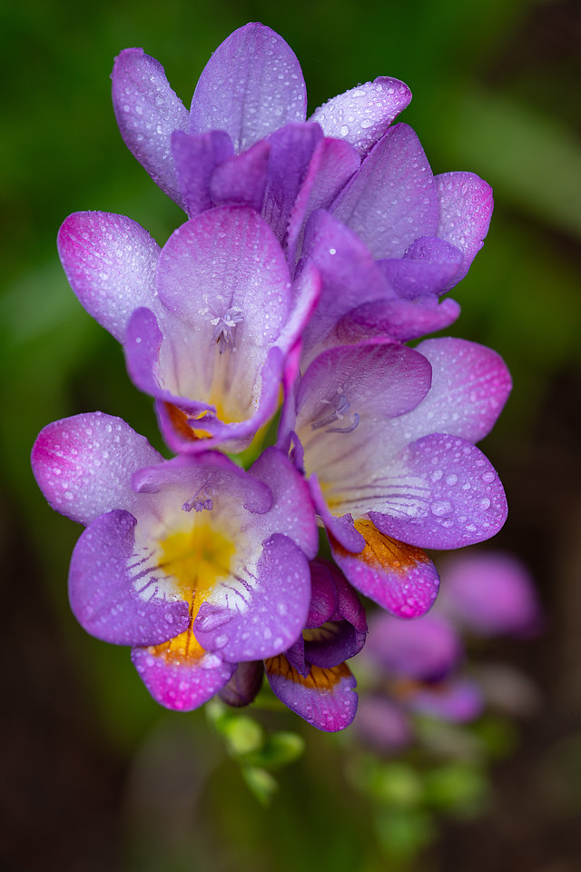
**Purple**: Often associated with luxury and creativity, purple can add a sense of sophistication and mystery. Consider it for a study or an art studio to inspire imagination.
**Neutral Tones**: Colors like beige, gray, and white are versatile and timeless. They provide a perfect backdrop for bold art pieces or can create a minimalist aesthetic on their own.
**Choosing the Right Color Palette**
When selecting wall art, consider the existing color palette of your space. You can choose art that complements your decor or opt for contrasting colors to make a bold statement. Here are some tips to help you choose the right color palette:
1. **Complementary Colors**: These are colors opposite each other on the color wheel, like blue and orange. Using complementary colors can create a vibrant, eye-catching look.
2. **Analogous Colors**: These are colors next to each other on the color wheel, like green, blue, and purple. An analogous color scheme can create a harmonious and cohesive feel.
3. **Monochromatic Colors**: This involves different shades and tints of a single color. A monochromatic scheme can be soothing and sophisticated.
**Bringing It All Together**
When it comes to wall art, the possibilities are endless. Whether you prefer bold, abstract pieces or subtle, minimalist designs, the right colors can transform your space into a reflection of your personality and style. Here are a few final tips to consider:
- **Experiment with Different Art Styles**: Don't be afraid to mix and match different styles of art. A gallery wall with diverse colors and styles can add depth and character to your space.
- **Consider the Room's Purpose**: Think about how you use the room and the kind of atmosphere you want to create. This can guide your color choices and ensure they align with the room's function.
- **Trust Your Instincts**: Ultimately, your space should feel like you. Trust your instincts and choose colors that resonate with you and make you happy.
Incorporating color into your wall art is a wonderful way to personalize your space and express your creativity. We hope this guide inspires you to explore and experiment with colors in your home or office. Happy decorating, and remember to check out our collection for stunning pieces that will bring your walls to life!
Feel free to share your thoughts and favorite color combinations in the comments below. We love hearing from our fellow art lovers!